

|
|
 |
|
#1
 10-14-2010, 03:40 PM
|
||||
|
||||

__________________
All ambitions are lawful except those which climb upward on the miseries or credulities of mankind. ~ Joseph Conrad A long habit of not thinking a thing wrong, gives it a superficial appearance of being right. ~ Thomas Paine Don't let anyone tell you that your dreams can't come true. They are only afraid that theirs won't and yours will. ~ Robert Evans The Party told you to reject the evidence of your eyes and ears. It was their final, most essential command. ~ George Orwell, 1984. 
|
|
#2
10-14-2010, 03:43 PM
|
||||
|
||||

__________________
All ambitions are lawful except those which climb upward on the miseries or credulities of mankind. ~ Joseph Conrad A long habit of not thinking a thing wrong, gives it a superficial appearance of being right. ~ Thomas Paine Don't let anyone tell you that your dreams can't come true. They are only afraid that theirs won't and yours will. ~ Robert Evans The Party told you to reject the evidence of your eyes and ears. It was their final, most essential command. ~ George Orwell, 1984.
|
|
#3
10-14-2010, 03:45 PM
|
|||
|
|||
|
Quote:

|
|
#5
10-14-2010, 04:25 PM
|
|||
|
|||
|
I like the Derby one, the Oaks...not so much. Too pink.
|
|
#7
10-14-2010, 04:27 PM
|
||||
|
||||
|
Oaks makes me want to kill things.
|
|
#8
10-14-2010, 04:56 PM
|
|||
|
|||
|
Quote:
|
|
#9
10-14-2010, 07:26 PM
|
||||
|
||||
|
Quote:
Top heavy with the bolded 137... The horse head should be on the top... hell even if they just reversed the horse head and where it says Kentucky Derby it would improve it. I think they should do away with the date and the location? Come on do they really need to even say it? Makes it cluttered, everyone knows where it is. I like the other one. Wish there were just the slightest bit of movement in the horsie head so it didn't look like a chess piece but sure... it's fine. It, at least, has a sense of balance.
|
|
#10
10-14-2010, 07:27 PM
|
||||
|
||||
|
Quote:
 It would look even cooler with Blockateil (sp) perched on top...
|
|
#11
10-14-2010, 11:18 PM
|
|||
|
|||
|
Quote:
Have Gun Will Travel with Paladin... this is first image that I thought of when I saw Oaks logo
__________________
@wire2wirewin Turf Economist since 1974
|
|
#13
10-15-2010, 08:53 AM
|
||||
|
||||
|
The Oaks logo seems to remind me of a promo for the Boris Spasky-Bobby Fischer chess match years ago.
__________________
A racehorse is an animal that can take several thousand people for a ride at the same time. ~Author Unknown
|
|
#14
10-15-2010, 09:07 AM
|
||||
|
||||
|
Rain is in the forecast.

|
|
#15
10-15-2010, 09:23 AM
|
||||
|
||||
|
Quote:
The Derby logo is a mess of what appears to be an assemblage of clipart. The horse neck looks like a two lane highway. The reused rose in a horseshoe still looks like a swirling toilet bowl just after flushing. The chopped off 137 is bad, the date format is weird. Otherwise, it's a nice logo. Edit: I knew I had this somewhere: 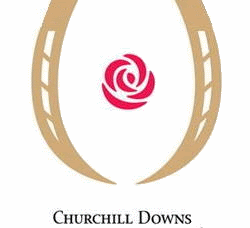
__________________
"We are buried beneath the weight of information, which is being confused with knowledge; quantity is being confused with abundance and wealth with happiness. We are monkeys with money and guns. " ~ Tom Waits
|
|
#16
10-15-2010, 09:40 AM
|
||||
|
||||
|
Looks like last year with different coloration and a slight change in the arrangement.
__________________
Do I think Charity can win? Well, I am walking around in yesterday's suit.
|
|
#17
10-15-2010, 10:59 AM
|
|||
|
|||
|
Quote:
__________________
Quote:
|
|
#19
11-17-2010, 11:24 AM
|
||||
|
||||
|
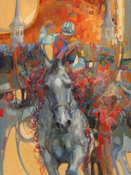
Derby 137 Poster Art
__________________
All ambitions are lawful except those which climb upward on the miseries or credulities of mankind. ~ Joseph Conrad A long habit of not thinking a thing wrong, gives it a superficial appearance of being right. ~ Thomas Paine Don't let anyone tell you that your dreams can't come true. They are only afraid that theirs won't and yours will. ~ Robert Evans The Party told you to reject the evidence of your eyes and ears. It was their final, most essential command. ~ George Orwell, 1984.
|
|
#20
11-17-2010, 11:25 AM
|
||||
|
||||
|
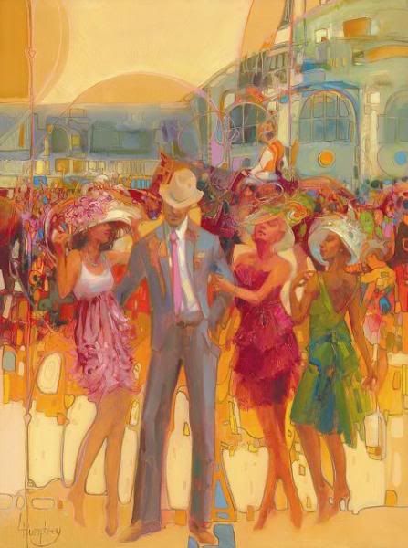
Oaks 137 Poster Art
__________________
All ambitions are lawful except those which climb upward on the miseries or credulities of mankind. ~ Joseph Conrad A long habit of not thinking a thing wrong, gives it a superficial appearance of being right. ~ Thomas Paine Don't let anyone tell you that your dreams can't come true. They are only afraid that theirs won't and yours will. ~ Robert Evans The Party told you to reject the evidence of your eyes and ears. It was their final, most essential command. ~ George Orwell, 1984.
|


 Linear Mode

