
|
2008 Derby Poster
I wonder how much money is spent on creating a poster each year.
http://www.courier-journal.com/apps/...FUN03/80131055 |
That's actually the Festival poster.. the 2 week hoo-hah around Lu'ville...
This is the Derby/Oaks artwork which cleverly 'connect'.. DERBY POSTER 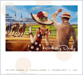 OAKS POSTER  'CONNECTED' LIMITED EDITION  |
Well I think it's another attempt to focus on the fan rather than the product. I guess it's kind of neat. It could be worse, they could have me paint it.
|
Looks a little like the woman on the left is clawing at the chest of the one in the middle.
I like the other one though. Don't love it but it's..... fine. |
Quote:
|
first derby poster in a while that I have actually liked.
|
I like it alot, too actually - except the 6 furlong difference between the front and back of the field seems a little weird to me <g>
(btw those seats are available for Twin Spires Club members for only $1200! ;) |
Quote:
My absolute favorite favorite from the last few years... Have it and need to get it to my framer... 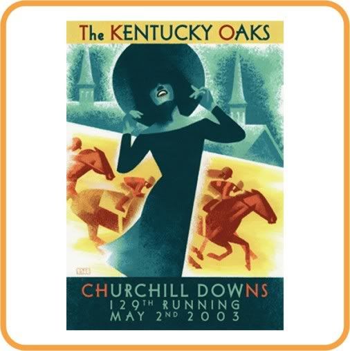 Also terrific...  Neiman... 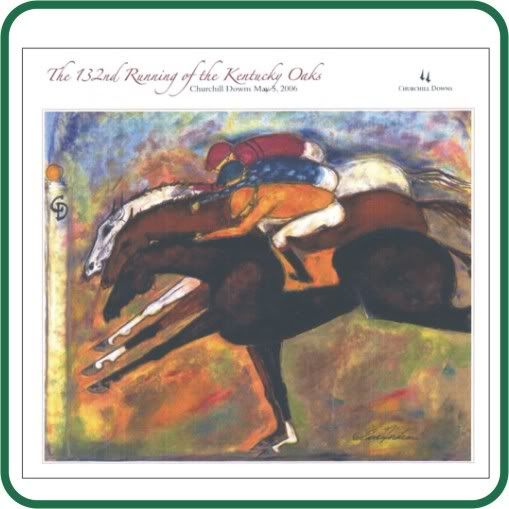 Last year... Was OK too.. 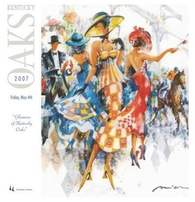 |
I really like the second one!
|
Quote:
it's no secret that you and I don't have the same taste....I don't like those one's that you posted.... |
Quote:
|
Kinda looks like Doonesbury.
|
I was a fan of the 2005 Derby print.
|
Thinking about it, good point about the Oaks, I tend to prefer those, too.
|
Quote:
|
I think about what the KY Derby is like in May - all bright pastels and light, sunshine, spring, excitement, hope, movement - I find the brown and blue 2003 poster just depressing.
|
| All times are GMT -5. The time now is 04:26 PM. |
Powered by vBulletin® Version 3.6.8
Copyright ©2000 - 2026, Jelsoft Enterprises Ltd.