
|
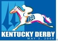
2008 Derby Logo
Better than last couple of years...
 |
...
Is there a rave in the infield? WTF? |
Quote:
|
Is it me or does that horse looking like a Steeplechase horse landing after a hurdle?
You would think Churchill Downs could pay a graphic artist to get an accurate depiction of a Thoroughbred racing. |
Quote:
 Quote:
|
Quote:
|
looks kind of fruity
|
I have to agree with Mr. Pants. Terrible.
|
not very good at all.
but then it's par for the course, last years was bad as well. |
"can I have $200 win on #134"
|
Looks a bit "hokey" to me. Does look like a jumper not a race horse.
|
It reminds me of Currier and Ives prints, where the horses were depicted galloping in unnatural positions.
Kinda funny that that poster went through "vetting" by a focus group. Must be a consensus result :p |
Churchill was going to use this one :eek:
 |
Quote:
|
Quote:
Ditto |
Maybe Kentucky is going politically correct....Horse racing meets the gay pride colors
|
I sweat to God, it looks like something a 1st grader made. Not that it matters what the logo looks like, but why bother if that's the best you can do?
|
Quote:
The first message I got was that the horse was running the wrong way :o :) |
Quote:
More euro infuence. he's running the wrong way. |
Quote:
i thought the same thing!! then i decided to give them benefit of the doubt, and assume the pic was 'taken' from the infield side. |
Quote:
|
horrible
it is just plain awful
|
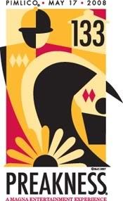
And the Preakness logo for consideration:
 |
Quote:
|
I will take worst logo's ever for $300 Alex!
|
Looks like someone threw up on a Preakness poster.
|
Quote:
What a mess, are they out of their minds. I thought Dali and Picasso were dead. Makes the Derby logo look magnificent now. |
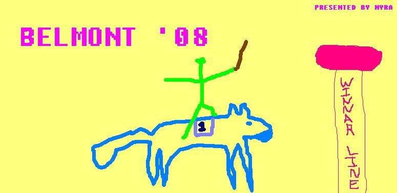
One of the finalists for the Belmont.
 |
Quote:
The sad thing is, it's the best of the three. |
Quote:
|
Quote:
|
Quote:
Agreed...that NYRA post made my day!:D |
Quote:
For what it's worth, I kinda' like it. I mean..the Belmont below blows it aways, but it's better than the Derby |
Quote:
|
Quote:
|
Quote:
|
Quote:
|
Quote:
Best post in the history of the board!!!! LMAO! |
Pillow that was some funny funny stuff...
|
| All times are GMT -5. The time now is 01:38 PM. |
Powered by vBulletin® Version 3.6.8
Copyright ©2000 - 2026, Jelsoft Enterprises Ltd.